Rediscovering Treasures in the Lobby of a High Rise
A RESIDENTIAL HIGH RISE REBORN
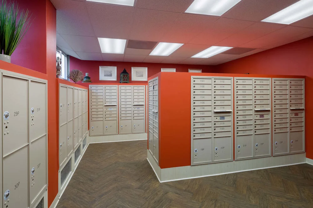
Old buildings often have great original floors and this building was no exception. Underneath the carpeting, we found a black and white marble floor that needed major TLC but had lots of potential. After some serious work, the dramatic floor was restored and became a great starting point for the lobby’s redesign. The project also included the creation of a new cheerful mailroom that picks up the accent colors from the lobby and is accessorized with pieces that pay homage to the building’s river location.
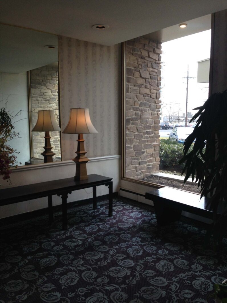
In selecting furniture, the goal was to make the lobby look residential although we used durable, commercial finishes. In accordance with the client's wishes, the furniture plan is aesthetically pleasing but, in reality, it's socially awkward in order to prevent the lobby from becoming a place to hang out. There is minimal seating and the bench by the front entrance has no back — good for waiting for a ride but not for lingering.
After - The building's age and location near historic Philadelphia called for vintage pieces, such as these custom French bergère chairs. The original mirrored columns were retained as a security feature. The walls are covered in Xorel, a commercial wallcovering that is washable, bleachable and has some reflectiveness, which adds to the airiness of the space.
After - The floors were restored (see the photo below), the brass trim was painted black and new custom covers were ordered for the baseboard heating. Because the building has a no-pet policy, the dog sculpture has become a bit of a mascot. One occasionally finds residents petting it!
Before - The lobby looked dated and dark.
Before - Elevator area | See after picture below
Before - The hidden treasure-black and white marble flooring was found under the dated carpet.
After - A beautiful chaise and building-friendly dog.
Left - View of the same area (on the right) before the redesign.
After
After
After - In the elevator area, we recycled the large mirror, added reclaimed wood for interest and texture and installed beautiful sconces for aesthetic and functional reasons. The textured vinyl bench cushion is both beautiful and durable. .
After - The mailroom is a new addition to the building's first floor.
After - Accessories and artwork reflect the building's location by a river.
All "after" photos by Paul S. Bartholomew


